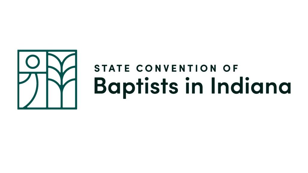
The State Convention of Baptists in Indiana recently announced the results of a rebranding project that they launched earlier this year.
“You’ll see a new logo but there is so much more that goes into a rebranding effort like this,” Ryan Strother, SCBI executive director, shared. “I learned a lot through the process and really enjoyed working with the creative people leading this effort for us.”
New look
Part of the reason for the rebrand, Strother explained, is the previous branding was at least 10 years old.
“In part, a new logo and coloring will modernize our look and communicate freshness in our approach to serving churches,” he said. “This is the least important reason, but an innovative convention does not need to convey staleness.”
Personality and new strategy
The new logo and messaging were created through working with Useful Group, which was contracted to lead the project, Strother said.
“I was amazed at how The Useful Group developed a survey to capture responses that gave them insight into our convention,” he said.
To assist with the rebranding, about 60 people (staff, board members and pastors) completed a survey which asked them to share thoughts on the current state of the convention and their desires for the future.
“The creative team took this data and infused it into a unique logo that expresses our personality and new strategy of partnering with churches to discover and fulfill their next step,” he said.
The explanation of our logo: We were inspired by how the people of Indiana connect so well to both the people around them and the place they inhabit. This logo brings to mind a tile, a whole unit composed of three essential representations of the SCBI. Each part emphasizes the importance of people and place. The sun in the top left represents the biblical goal of unity and wholeness. The curved lines in the bottom left-hand corner remind us of country roads, and the branching form on the right side serves as a symbol of both the crops that support Indiana and the SCBI’s desire to connect with their member churches. The arching lines that makeup corn or wheat also can be seen as a view of three rows of people standing shoulder-to-shoulder. Finally, the left two components reflect an “i” form for Indiana.
The new branding, Strother noted, also includes a foundational tagline (or brand slogan), which is a short, memorable phrase that reflects the SCBI: Grounded & Growing.
“Our convention is grounded and growing,” he said. “This is a nod to and respect for our convention’s history and theological grounding in Scripture, as well as a recognition of trust between our churches and their convention. Additionally, ‘growing’ is a reminder that we are constantly gaining momentum in our mission work together.”
EDITOR’S NOTE — This story was originally written and published by the Indiana Baptist, news service of the State Convention of Baptists in Indiana.

